Error 404

Unpopular Opinion: 404 pages should be pretty and fun. Hear me out, 404 pages should be more than just a huge 404 text and a go back button. They should at least be integrated into the website's main layout.
The term 404 is a HTTP status code that means the server can't find the requested page. Only developers would know this. Why bother showing this to your consumers if there is a high chance they wouldn't know what it means? It's a dead end to the Internet. But it doesn't have to be. It can be a gateway to your other content.
Take a look at the 404 page I have designed for this site. It's a simple and fun page that fits into the website's main layout. It's not just a boring white page with a 404 error message. It fits the space theme well and it's a fun little easter egg for people who stumble upon it. The text 404 is replaced with a null symbol, which is a more universally understood symbol for "nothing".
By integrating the 404 page into your main website layout, your users can immediately use the navigation and redirect themselves to other parts of your website.
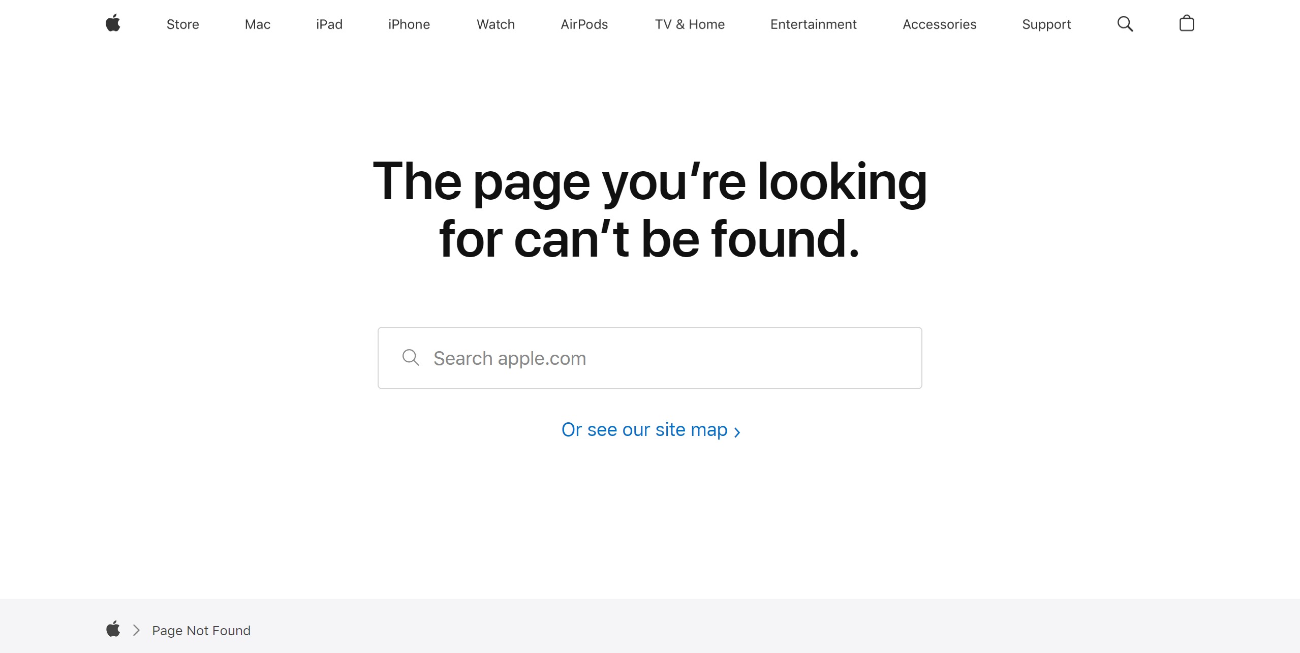
Case Study: Apple

Even Apple recognizes the importance of a search bar on a 404 page. It seamlessly integrates into their design without explicitly stating the page's error and the user will immediately know what is wrong with the page.
To score an excellent user experience, you cannot miss including a seamless 404 page experience. All websites should adopt useful UX practices such as these, which even trillion-dollar companies like Apple recommend, to enhance the quality of design and functionality.
Learn from the best.